
Data Analysis
UX Research
UX Design
Charlie’s Travels is Dutch travel agency focused on tailormade trips to Africa. I noticed a challenge with several travel destination pages: engagement dropped off before the end of the content and visitors often missed important information. There was a lack of consistency, with some pages showing more imagery, videography and information than others. This project focused on refining the pages to create a more balanced set and to optimize them for better engagement and deeper scroll depth. Eventually leading to a greater conversion of potential travellers becoming a lead.
During the redesign of the website in 2024, the customer journey of destination pages was revisited. After going through multiple customer journey sessions, I set up new wireframes which were evaluated with an external company to substantiate. However, during the build and directly after launch, ad hoc changes to the pages were made which left them inconsistent, unreasoned and overcomplicated.
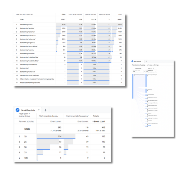
In general, the destination pages are important for the company. Between 75% and 77% of the leads that convert visited one or more destination pages at some point during their visit. Additionally, users often return to destination pages in multiple sessions and also visit them several times within a single session. This highlights the relevance of ensuring these pages are in optimal state.
Scroll depth of the different destination pages turned out to be a critical issues. While nearly all engaged users reached 25% depth, around half the users had left at 50%. Without a clear CTA before this break off point, the company was loosing potential leads.
While destination pages are meant to inspire potential travellers for a country, the analyzed pages had little information for general information. It included distracting elements such as downloads, webinars and an overemphasis on example trips. This left less space for storytelling and engagement.
Depending on the country, between 35% and 65% of inquiries happened directly via the form on the destination page. Only 15% used the enquiry button in the menu. This clarified the significance of keeping the ability to convert on a destination page.
In collaboration with the creatives team, I created a new page with new copy and new imagery. With the optimal customer journey in mind, I created a funnel on the destination page template. Travellers would first be provided with information on the country as a whole. Sparking their attention through imagery and words. After, it would zoom in on what the company provided for experiences and activities within the country. This part was there to show in-depth knowledge about the country from the companies side, show expertise and provide trust. It included a map of the country with copy to elaborate on the marked locations. The last part of the page would be more informational about the company and less related to the country. This part held elements about blogs, travel stories and reviews.
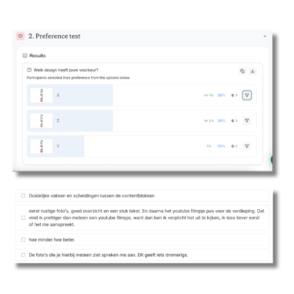
To substantiate the new design, four 30 minute interviews were held with previous customers of the company. These customers had all seen the old pages before but were not given any instructions to go through them again before the interview. The interview was not meant as a comparison between the two but as a stand alone research for the new design. Each interview used the think aloud method while I first asked them to go through the design. After this, we zoomed in on specific aspects such as the combination between the map and copy, the funnel aspect and other elements specifically mentioned by the interviewees.
In line with the results from the user interviews, a few elements were changed and rewritten. Some elements had to be redesigned or altered to better suit the needs of our users. For example, the accordion accompanying the map shouldn’t have the first element open while this distracts users from understanding the link between the map and the copy. Also, reviews are expected at the bottom of a page, so we moved them down. Opinions on the amount of copy differed so we opted for the longer version as users mentioned it didn’t bother them either.
The new destination pages have been online since September 2025 and results will be added to this page at the end of the year.